It's time to redefine the chart!
Created by @Kener-林峰
Innumerable charts library!
Why ECharts ?
Data Interactive Visualization
Data visualization with an interactive graphical user interface (GUI).
Data's visual presentation is not only for statement, bug also for data mining, integration to the data presented.
Make data visualization to be a way of people's visual thinking.
Let's find out what ECharts has done for this purpose?
* The following content is recommended full-screen (F11)
[ Drag-Recalculate ] Data reorganized
The default classification of chart can't always meet the needs of everyone.
Look at the following example: if you want to know the combined proportion that IE 6, IE 7, and IE 8 represent, what will you do? Mental arithmetic or take out a pen?
This is ECharts, try to drag the desired items on top of each other to combine them!
[ Drag-Recalculate ] Deal with outliers
There are often outliers in our data. Look at the following sales data in Chinese Single Day (11-11). Except the sales peak on Single Day, can you find something else?
This is ECharts, try to drag the outlier out!
Wow, after dragging that out, can you find some trend which is not optimistic?
[ Data View ] Sometimes we need the original data
If the data presented is important to the users, then they will not satisfied to see a visual chart.
This is ECharts, Try to click![]() !
!
You can even edit your data and update the chart! Compared with Drag-Recalculate, this is batch operation!
[ Magic Switch ] Try different charts at once
We can use different charts to express the same data. However it's hard to make an always-good choice since their performance depends on data, personal preference etc. For example, choose a bar chart or a line chart ?
This is ECharts, you can switch the chart magicly!
Try to switch the bar chart![]() to the line chart
to the line chart![]() , or from stack to tiled
, or from stack to tiled![]() , maybe you will have more interpretation of this data.
, maybe you will have more interpretation of this data.
[ Magic Switch ] Try different charts at once
We can use different charts to express the same data. However it's hard to make an always-good choice since their performance depends on data, personal preference etc. For example, choose a bar chart or a line chart ?
This is ECharts, you can switch the chart magicly! Maybe you will have more interpretation of this data.
[ Scale Roaming ] Focus on the interested data
We can use different colors in Coordinate based charts (like map or scatter) to show the distribution of the data vividly.
But how can I focus on the data that I am interesting in? For example, how to look over the top 10% area? Find pen again?
This is ECharts, You can do scale roaming: try to drag the color scale up or down.
The mean of this doesn't need more explanation.
[ Space Zoom ] Focus on the interested data
Display space is always limited, so we need Space Zoom, you can zoom the space easily.
This is ECharts, you can use the drag chooser at the bottom or the block chooser![]() to zoom in or back
to zoom in or back![]() ! Of course, they are always in lockstep.
! Of course, they are always in lockstep.
Maybe you have found the Extreme MarkPoint and the Average MarkLine are also in lockstep.
[ Linkage ] More powerful tool for data correlation analysis
Sometimes, multi-series data in one chart would be confusing. However, they are associated and can't be separated?
This is ECharts, we provide a capability called "Linkage".
[ Mixed Timeline ] Expand the dimension of time
Time data analysis is a very important direction in information visualization!
This is ECharts, we provide a timeline control which can be mixed with any charts to show the spatio-temporal data changes.
[ Mixed Timeline ] Expand the dimension of time
Time data analysis is a very important direction in information visualization!
This is ECharts, we provide a timeline control which can be mixed with any charts to show the spatio-temporal data changes.
[ Large-scale ] Show the charm of big data
How to show hundreds of discrete data in order to identify their distribution and clustering?
Oh, sorry should be hundred thousand, event million data! In addition to professional statistical tools(Such as MATLAB), it seems we have no choice, especially on the web!
This is ECharts, we can show 200,000 data in one second.
[ Force-directed layout ] Elegant display of networks
This is ECharts, we provide Force-directed layout to show network data.
For example, social networks of Job!
[ Force-directed layout ] Elegant display of networks
This is ECharts, we provide Force-directed layout to show network data.
Let's check a more complicated example: class depends relationship of Webkit Kernel!
[ Dynamically Addition ] Show your realtime data
New data comes every second, we should keep up with the rhythm.
This is ECharts, we provide dynamic data interface to add new data!
[ Legend Switch ] Switch to the interested data
Multi-series data show us many things, however somtimes we are just interested in some part of them. how to do ?
This is ECharts, we create some boxes to achieve this feature.
Just click on those legends, the meaning need no explanation !
[ Multi-dimensional Stacking ] More expressive chart
Sometimes the multi-dimensional stacking chart shows more expressively than a single stacking chart. However, we know that most of the charts don't support it.
This is ECharts, supported!
[ BI Component ] Some widely used business chart
The most common use of gauge chart is to display the key indicators for performance management. And the funnel plot is widely used in marketing analysis.
This is ECharts, we provide two highly customizable chart for this: Gauge and Funnel!
[ Mixed Charts ] Show the best mashup to your data
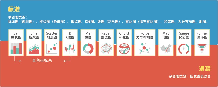
Sometimes the mixed charts will be more expressive and more interesting!
This is ECharts, the chart we provided(11 types) can be mixed freely.
[ Mixed Charts ] Show the best mashup to your data
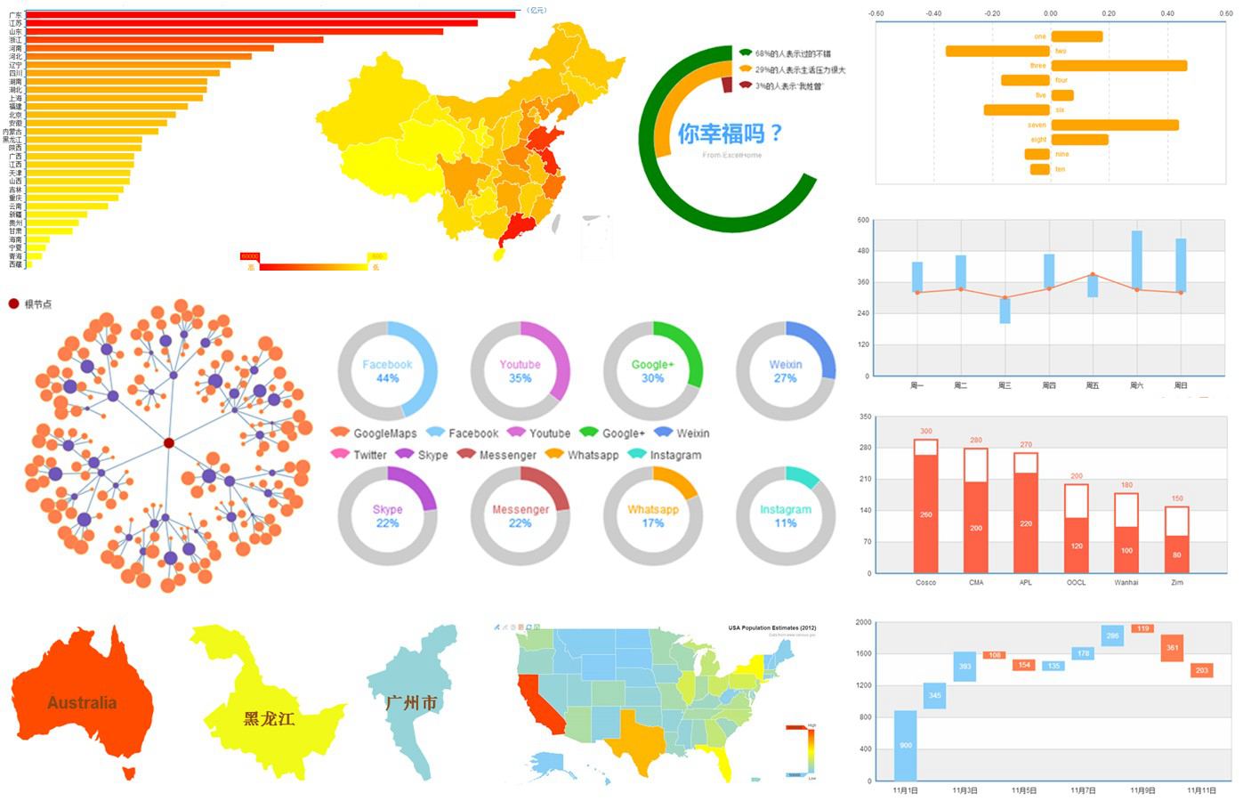
This is ECharts, the chart we provided can be mixed freely.
[ Mixed Charts ] Show the best mashup to your data
This is ECharts, the chart we provided can be mixed freely.
[ Mixed Charts ] Show the best mashup to your data
This is ECharts, the chart we provided can be mixed freely.
With the event handler you can event create an interactive system!
try click the map and you will find more fun.
[ Mixed Charts ] Show the best mashup to your data
This is ECharts, the chart we provided can be mixed freely.
Perhaps you can also play a bit of whimsy? Generally speaking, pie(radar) chart is not suitable for showing trends in data, how about lots of pie(radar)?
We call this multilayer nested as "lasagna" or "wormhole"!
[ Highly Customizable Capabilities] Creativity
Do not limit your creativity because of the chart ability. ECharts has more than 600 configured items, with a multi-level control system which make it has a highly customizable capabilities.
[ Glare Effect ] Ability to attract the eye
We know that many times we need to be cool.
ECharts has Glare Effects,especially use it on the map: Migration
And when you have a lots of data, you can try our Large-scale Glare MarkPoint Effects
[ Glare Effect ] Ability to attract the eye
We know that many times we need to be cool.
ECharts has Glare Effects,especially use it on the map: Migration
And when you have a lots of data, you can try our Large-scale Glare MarkPoint Effects
[ Glare Effect ] Ability to attract the eye
We know that many times we need to be cool.
ECharts has Glare Effects,especially use it on the map: Migration
And when you have a lots of data, you can try our Large-scale Glare MarkPoint Effects
Application - Baidu

Application - Others

ECharts VS Excel
Although those chart provided by Excel have no interaction at all, but its rich chart type and configuration, easy to use, Excel is the most commonly data statistics tools.
| # | ECharts | Excel |
|---|---|---|
| Histogram | Yes | Yes |
| Bar | Yes | Yes |
| Line | Yes | Yes |
| Area | Yes | Yes |
| Scatter | Yes | Yes |
| Bubble | Yes | Yes |
| K | Yes | Yes |
| Pie | Yes | Yes |
| Doughnut | Yes | Yes |
| Radar | Yes | Yes |
| Force | Yes | No |
| Chord | Yes | No |
| Surface | No | Yes |
| Map | Yes | No |
| EventRiver | Yes | No |
ECharts VS Highcharts (1)
The industry has countless JS chart, many outstanding representative, like chartjs, FusionCharts, amCharts, flot, RGraph, jqPlot, gRaphaël etc. Some are free and even open source, while others are commercial, you can find them easily.
Unable to compare with them all, let's choose Highcharts, an excellent, mature business chart library which is widely known in the world.
First about the charts type?
| # | ECharts | Highcharts |
|---|---|---|
| Histogram(Bar) | Yes | Yes |
| Line(Area) | Yes | Yes |
| Pie(Doughnut) | Yes | Yes |
| Scatter(Bubble) | Yes | Yes |
| Radar | Yes | Yes |
| K | Yes | Highstock |
| Force | Yes | No |
| Chord | Yes | No |
| Map | Yes | Highmap |
| EventRiver | Yes | No |
| Special(Gauge, Funnel) | Yes | Yes |
ECharts VS Highcharts (2)
Let's look at the features?
| # | ECharts | Highcharts |
|---|---|---|
| Drag-Recalculate | Yes | No |
| Data View | Yes | No |
| Magic Switch | Yes | No |
| Scale Roaming | Yes | No |
| Large-scale Data | Yes | No |
| Glare Effect | Yes | No |
| Linkage | Yes | No |
| Space Zoom | Yes | Yes |
| Legend Switch | Yes | Yes |
| Multi-dimensional Stacking | Yes | Yes |
| Mixed Charts | Yes | Yes |
| Image Export | Yes | Yes |
License & Pricing |
Free Baidu BSD |
Non-commercial free under CC3.0 Commercial licenses $90~$3600 |
This is ECharts
We just try our best to show the real data for you,
and provides an intuitive, easy-to-use interactive way to help you to deal with data mining, extraction, correction or consolidation,
(Drag-Recalculate, Data View)
so that you can focus on what you care about,
(Legend Switch, Space Zoom, Scale Roaming)
have different interpretation to the same data in different ways.
(Magic Switch, Multi-dimensional Stacking, Linkage, Mixed Charts)
Time to re-define the chart, browse the charts outputed by ECharts, you no longer just a "reader", you can participate. This is ECharts, an powerfull data visualizaiont tool with interactive graphical user interface.
Acknowledgement
ECharts cann't grow up without their excellent contributions :
@Kener-林峰
@pissang
@errorrik
@diysimon
@宿爽
@邓红启
@杨骥wind108369
@娄同兵
With their encouragement and support :
@cloud_wei
@李湛lizhan
@i我佛山人
@赵雷_Firede
@Yummy_zhou
Also, it's nice being with you...
@财财某
@沈浩老师
@统计之都
@大数据文摘
Finally, you'd be welcome to join us~
